Do you remember the Peter Kaye character Keith Laird? The Fire Safety Officer? This must be easily 15 years ago and I still can’t forget how funny it was when he read out the lyrics to ‘Burn Baby Burn, Disco Inferno‘ as part of his fire safety talk. And then someone shouting out ‘he’s drawing a dog’ (you would have to watch it). Genius character, especially how Kaye can parody real life in such a believable but hilarious way. The appeal of Keith Laird is that we all know a ‘job’s worth’ like that who takes his work far too seriously.
But, what can you say about fire safety? It’s a serious issue.
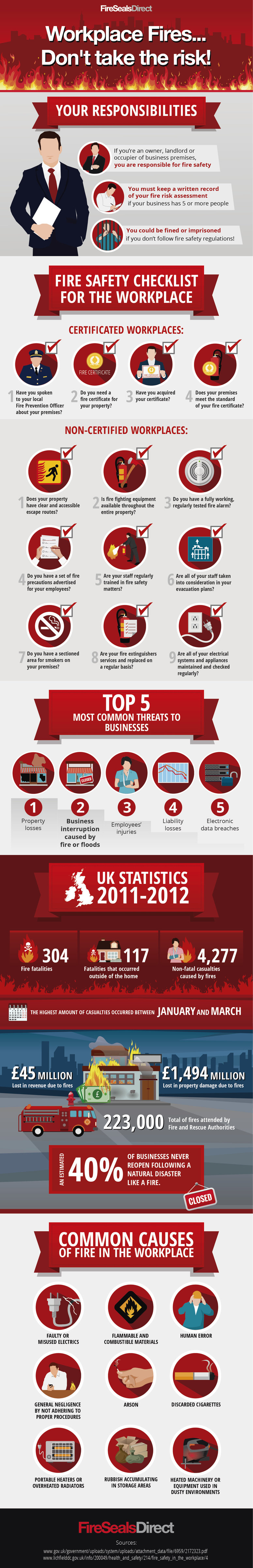
What I like so much about Workplace Fires Don’t take The Risk! Infographic from firesealsdirect.com is the presentation of the information in a public safety style with such strong use of illustration.
The top banner does what it says on the tin – it’s all about fire! I actually feel hot sat here just looking at the flames.
The banners to each section are distinct and well designed and reflect safety leaflet/poster in their style.
The icon illustrations are the real gem of this infographic, for me. Beautifully illustrated, crisp, clean, I love the shadows which add depth and dimension. The little ticks are a subtle and effective reference to safety information. Detail is what makes this graphic so strong.
Typography is very strong, all information is clearly delivered.
Another of my favourite aspects is the use of colour. The red is such a warm rich colour and contrast perfectly with the grey, white and accents of blue.
I love this graphic and I think it does a perfect job of delivering safety information. I would like to see a pdf download version that people can print off and use at work.
Overall, Workplace Fires Don’t take The Risk! Infographic gets an 8.5 out of 10.