Crime always seems to be topic de jour and heated debates around what to do about it are popular social conversations. Whatever the content of the discussion the general agreement is that they want to see change and expect the goverment to do something about it.
When looking for a house to buy or a flat to rent how much does the local crime rate impact on your decision? House prices are much lower in ‘bad’ areas but is that enough to justify paying cheaper rent. Considering you will pay higher prices in insurance and possible loss through break-in. Do you even look at the local crime rate?
There is no escaping the fact that we have to accept crime is a part of our society. Whatever the reason it exists, which isn’t the discussion here, we have to live with it and face the reality.
How Safe Is Your Area Infographic from CIA Landlords offers an insight of national crime rate statistics in the UK.
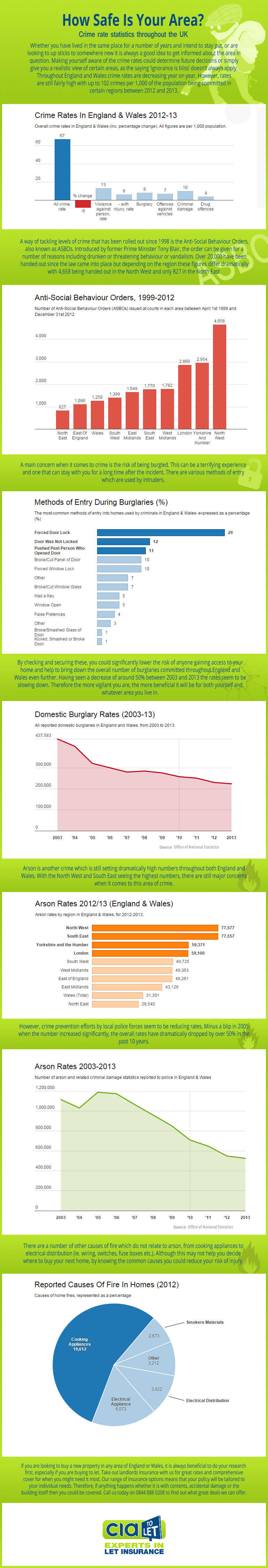
Positively domestic burglary rates have dropped considerably over ten years: 2003-13 as have arson rates. The most surprising statistic in this infographic is the amount of ASBOs handed out in the North West in comparison to all other areas. Maybe the North West has a very keen Police force with a quick hand for signing orders but it is an extreme difference!
Each section is clearly divided and all statistics are delivered as clear graphs. The colour palette uses a pleasing fresh lime green with accents of blue and red on the graphs. I like graphs, they deliver information in the most efficient visual manner. The content is of general social interest and offers useful tips alongside the data. I would recommend that the typography be increased as it is on the small side for reading inbetween the sections.
Overall I give How Safe Is Your Area Infographic a 7 out of 10.